| Rebranding |
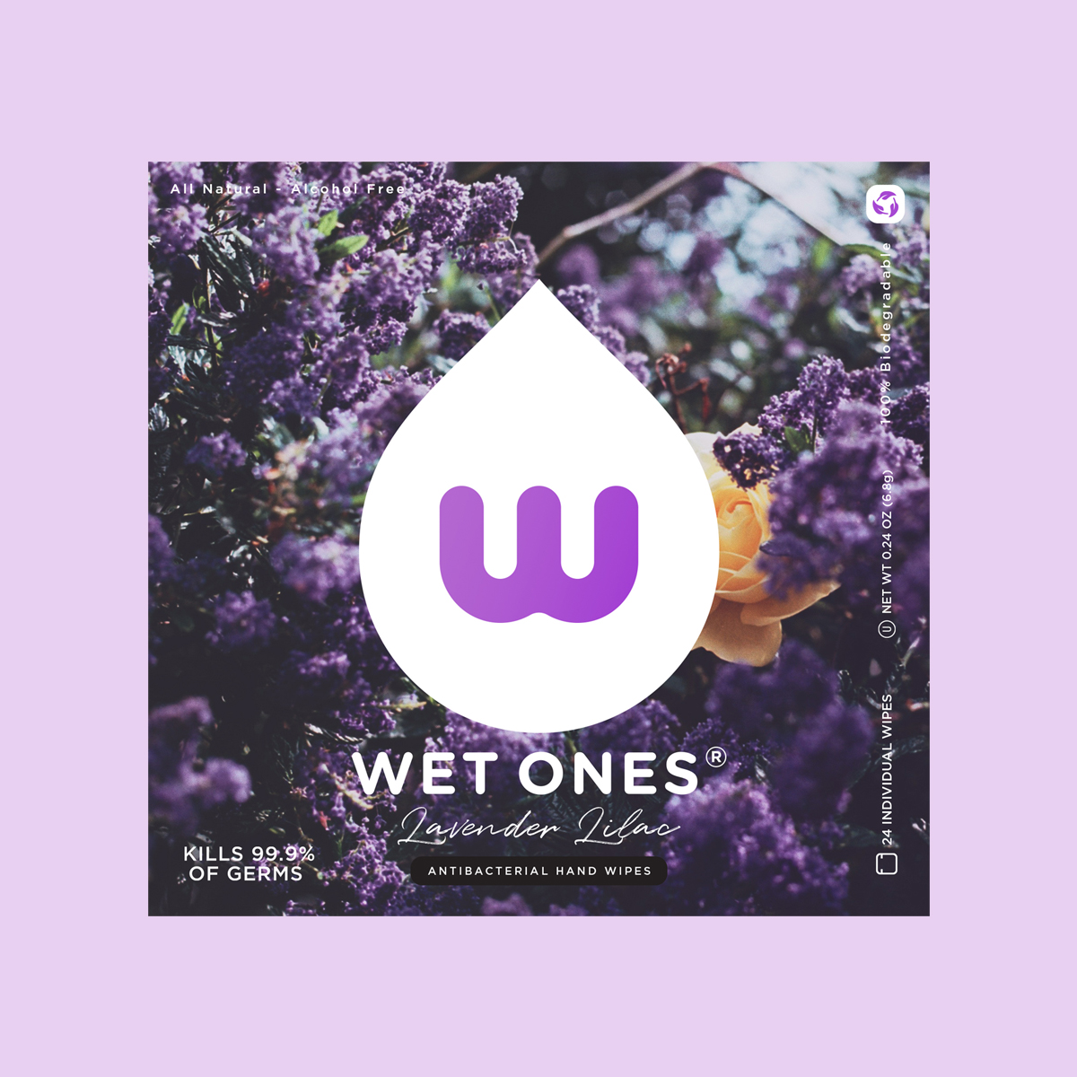
| This was an interesting product to rebrand. I wanted to strip away everything I knew about Wet Ones, a nd come up with a whole new product. But in order to do that, I needed to rework the logo. For tis particular product, I wanted to go environmentally friendly, with 100% biodegradable packaging from recylced material. The wipes would be 100% cotton, and the fragrance and germ killing formula would be made from natural ingredients. The new product would be targeting young, modern women with a sense of style. These women would be well-off, working, and active, but also care environmentally conscious.. |
|